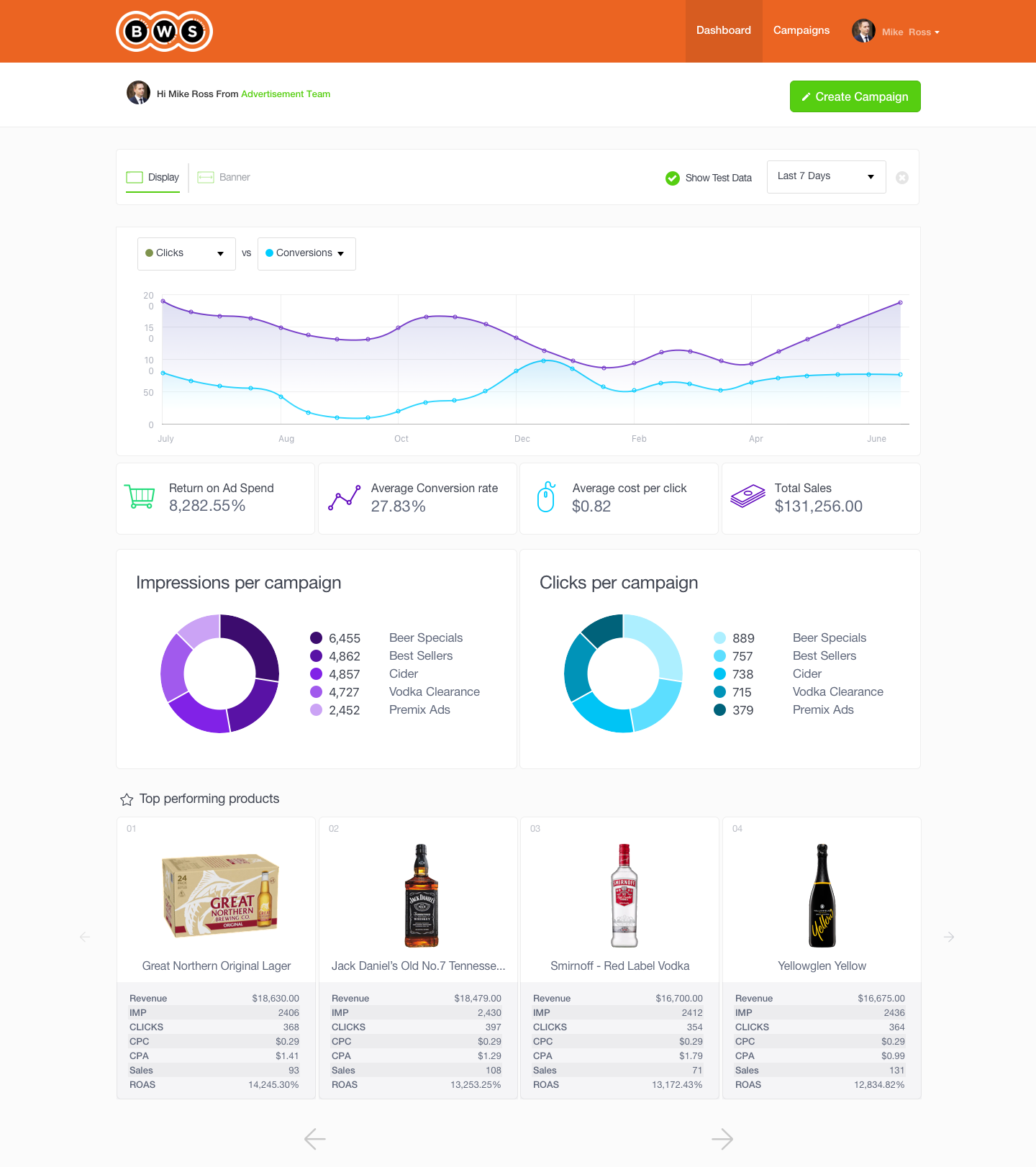
The Dashboard
The first page you see when you log in is your dashboard. The dashboard page is designed to give you a birds-eye view of your advertising activity. This includes performance trend graphs, top-performing campaigns and top-performing products. You can further drill down into any of these aspects by clicking the relevant links.

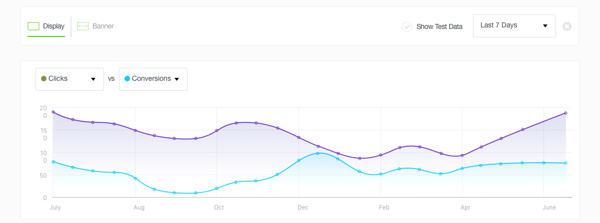
The Line Graph
The line graph gives you an overall trend line on how your campaigns are performing over a specified time period. The default time period is set to the last 30 days, but you can change the date range by clicking on the date picker in the top right-hand corner. Changing the date also changes all other metrics on the dashboard.

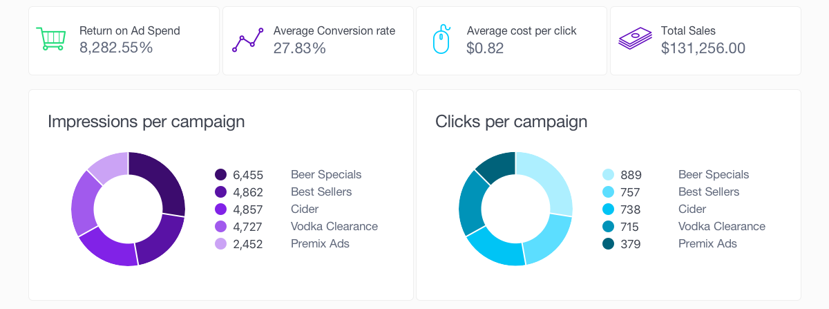
Key Performance Indicators
The middle section of the dashboard contains key performance metrics for your campaigns. The four metric boxes across the top show combined data for all of your campaigns, whilst the two pie charts illustrate which of your campaigns are getting the most impressions and clicks

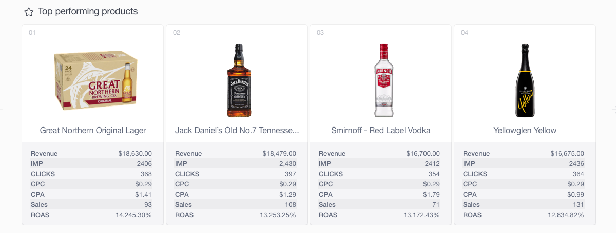
Top Performing Campaigns
At the bottom of the page, the dashboard presents your top-performing products in a detailed grid illustrating key metrics on each of the ads. The carousel contains up to 8 ads, and you can use the left and right arrows to scroll through the top performing products.

Updated over 7 years ago
